Wexa AI
Platform Redesign
Redesigning the first 10 screens of the primary user flow of an AI automation platform - improving the Dashboard, Apps and Connectors experience without changing how the product works.
Role
UI/UX Designer
Platform
Wexa AI
Tools
Figma
Project Type
Product Redesign
Main Dashboard
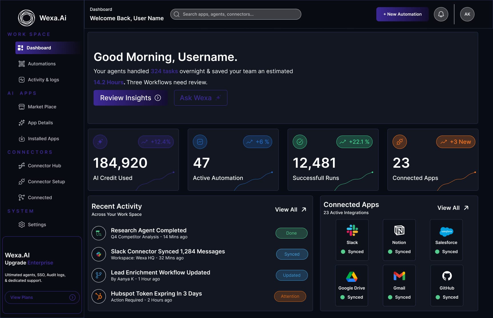
Overview
Wexa AI is an automation platform that helps users build AI agents, automate workflows and manage integrations. I redesigned the first 10 screens after login, focusing on Dashboard, Apps and Connectors while keeping the existing functionality intact.
The Problem
The interface felt crowded and difficult to scan
Navigation was not very intuitive
Components were inconsistent across screens
Finding and managing AI agents took too long
Integration status was buried inside Connectors
Key Insight
“The product wasn't missing features -
it was missing hierarchy.”
Everything users needed was already there. It just competed for attention equally, so nothing stood out.
Redesign Principles
Lead with outcomes
The dashboard answers what happened overnight before it offers a single setting.
One component language
Cards, chips, search and filters defined once and reused across all 10 screens.
Status you can read without reading
A single chip system, so the item that needs attention is the only one that looks urgent.
An obvious home for every task
The sidebar groups screens into Work Space, AI Apps, Connectors and System.
Apps & Connectors
The two areas the redesign focused on - finding agents, and connecting the tools a team already uses.
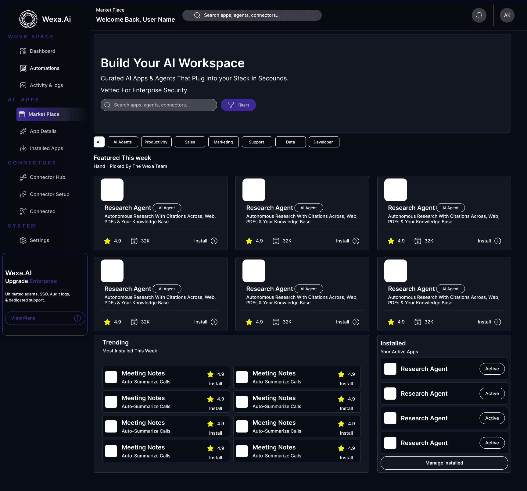
AI Marketplace
Search, filters and a hand-picked featured row - with your installed apps sitting right alongside, so discovery and management stop being separate jobs.
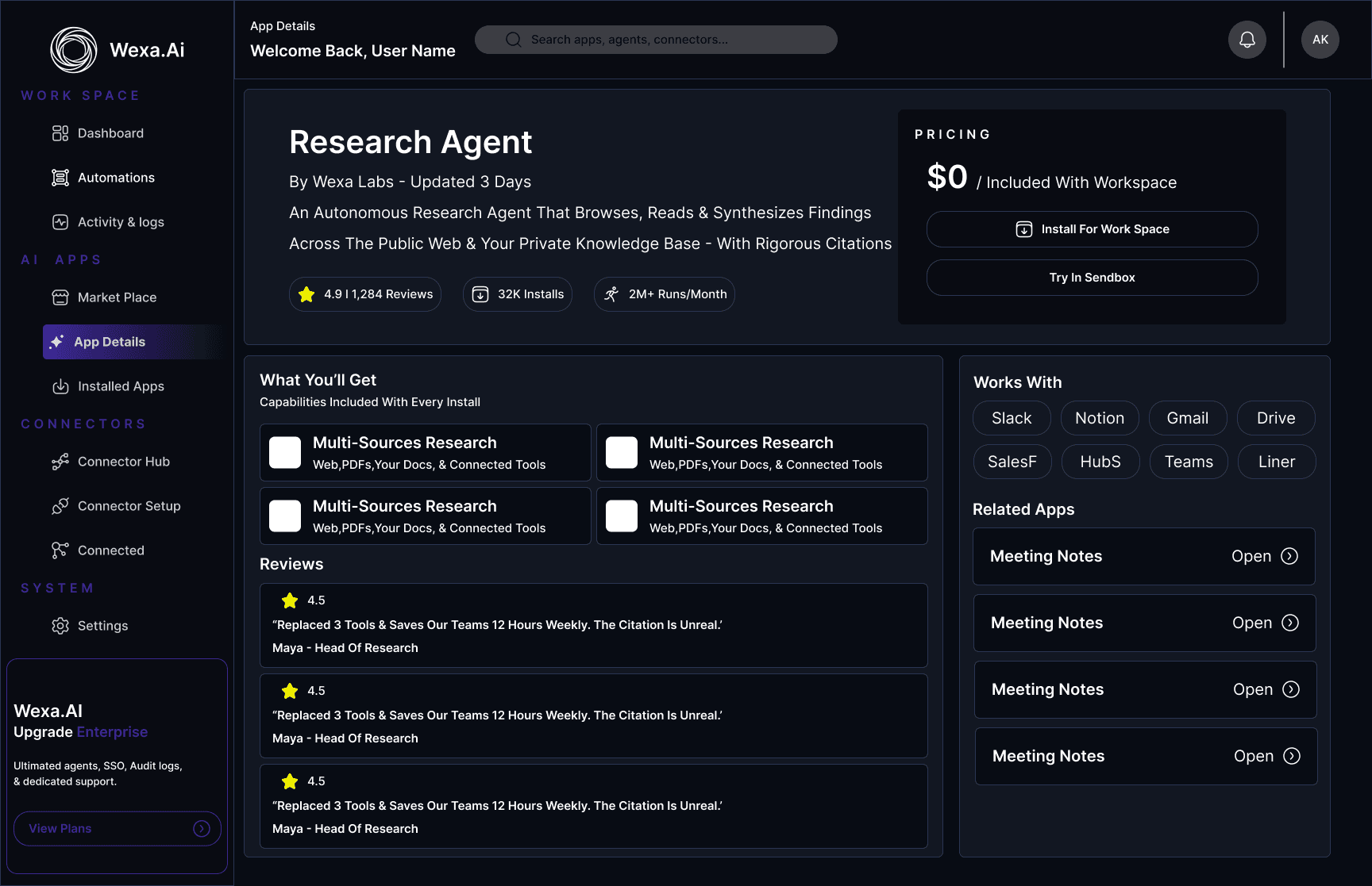
App Details
One focused view that answers what the agent does and what it needs, before anyone commits to installing it.
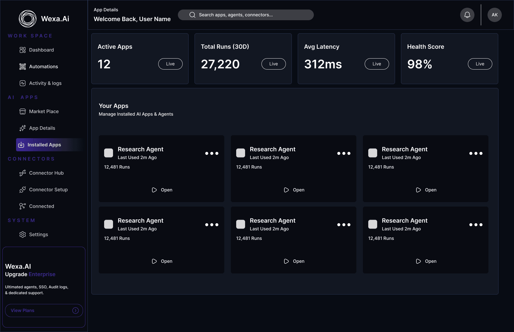
My Apps
Health metrics lead - active apps, runs, latency, health score - then every installed agent as a card with a single clear action.
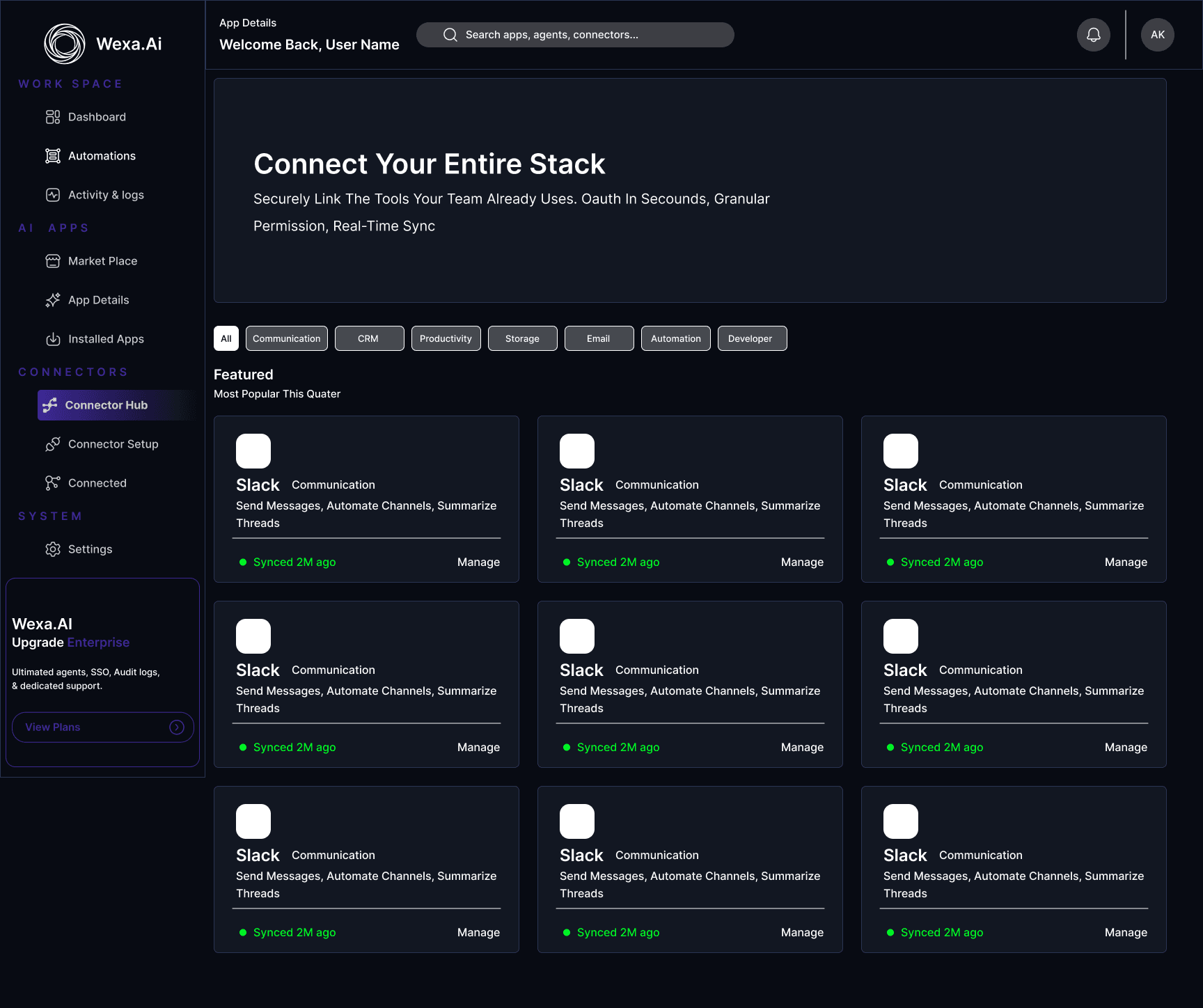
Connector Hub
Every integration browsable by category, each card carrying its live sync state instead of hiding it a level deeper.
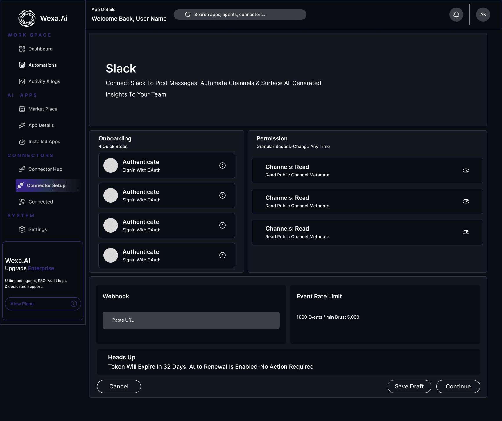
Connector Setup
A stepped flow that makes scope and permissions explicit - the most anxious task in the product, made predictable.
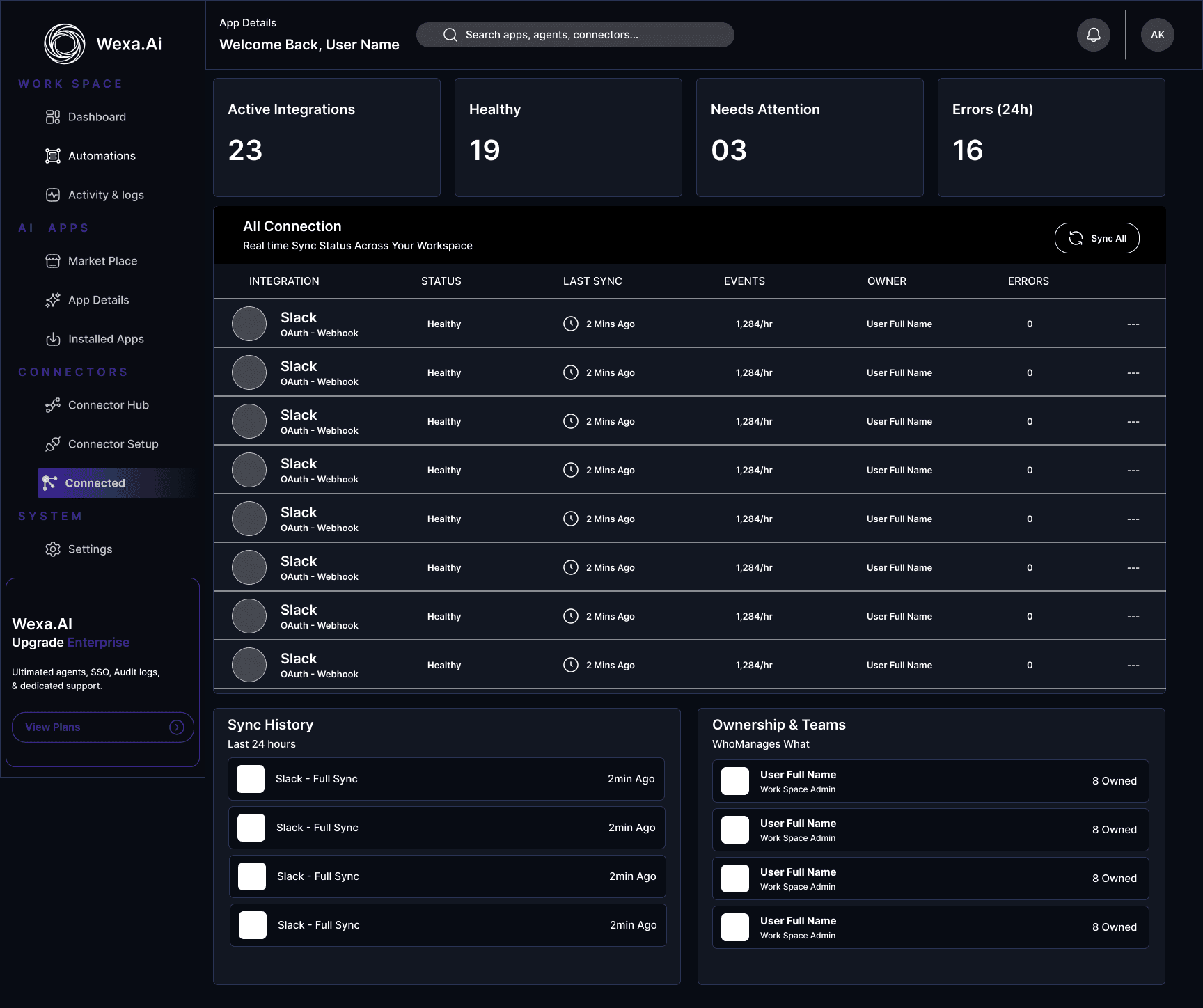
Connected Apps
The source of truth for what is live. Sync health and token expiry surface before something breaks, not after.
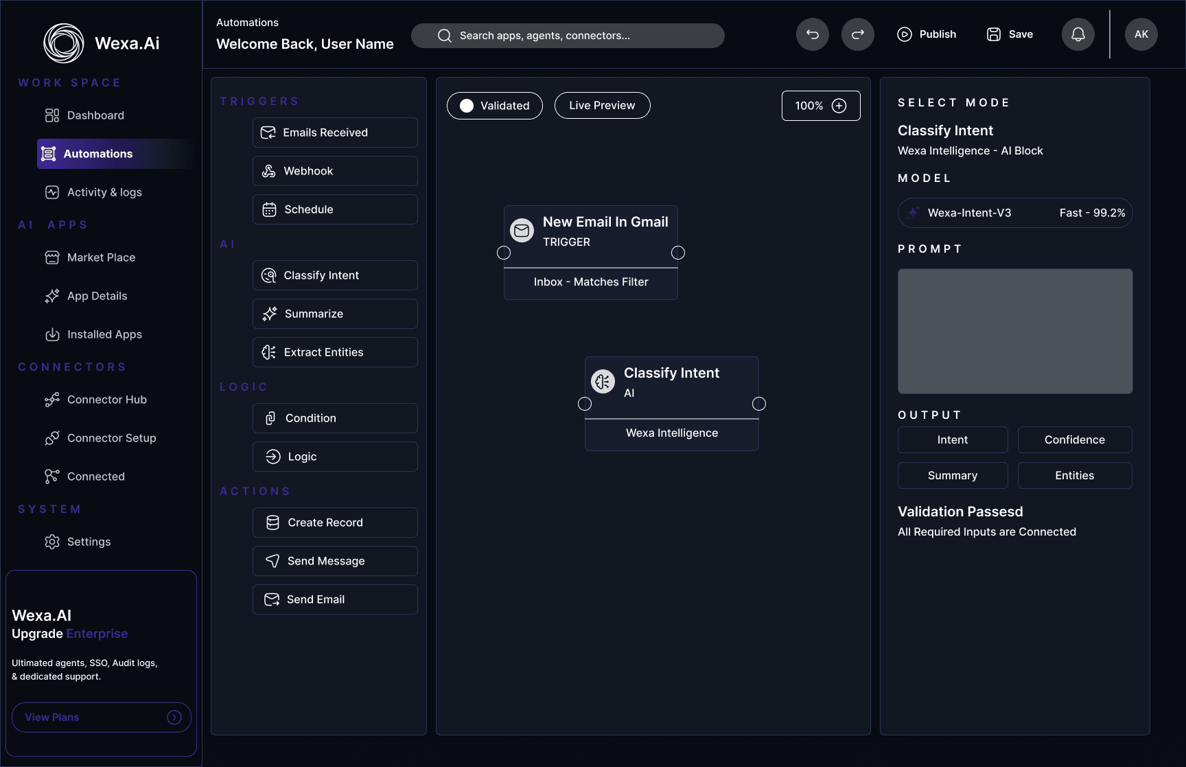
Work Space & System
The daily surfaces - where users check what ran, what broke, and what needs changing.
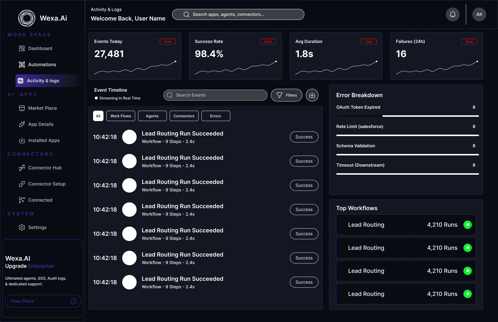
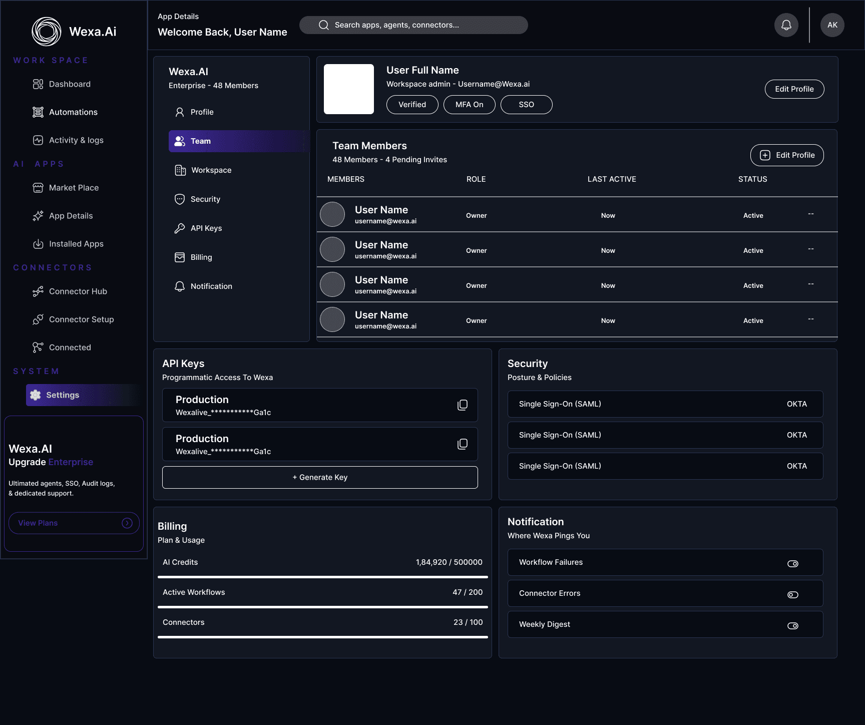
Dashboard
Opens with what the agents did overnight, then live metrics and recent activity.
UX Strategy
The brief was to improve the experience without touching the workflow - so every gain had to come from hierarchy, consistency and structure rather than new features.
Same Workflow, New Surface
Every existing capability kept its place. Nothing users knew how to do had to be relearned.
Scannable Over Dense
Spacing and type do the sorting, so a screen can be read in seconds rather than studied.
Consistency Across Screens
A component fixed once improves all 10 screens - and makes the product feel considered.
Accessible By Default
Contrast, type sizes and tap targets checked on every screen, not retrofitted at the end.
Screens Redesigned
Who It Is For
Results
Visual Hierarchy
Screens can be scanned instead of studied
Navigation
Four labelled groups give every task an obvious home
SaaS Feel
A modern product surface, with the original workflow untouched
Outcomes Before Controls
The dashboard opens with what the agents did overnight - tasks handled, hours saved, workflows needing review - before it offers a single setting.
Status as First-Class Information
Sync state and token health moved to the surface of every card, so a failing integration is visible before it becomes a support ticket.
Conclusion
“This redesign shows how far a product can move on hierarchy, consistency and structure alone. By rebuilding the first 10 screens on a single design system - without touching the underlying workflow - Wexa AI reads as a modern, premium SaaS product while doing exactly what it always did.”